Restaurant Redesign

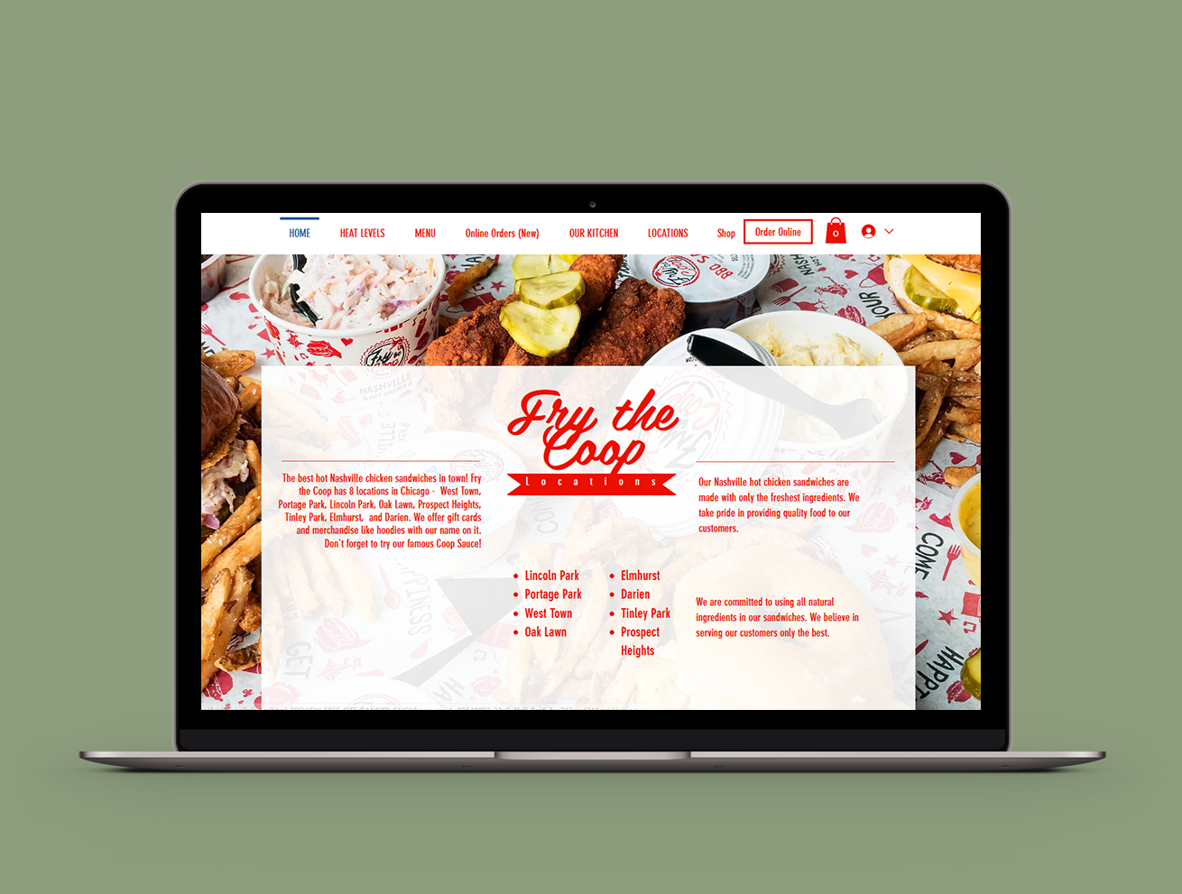
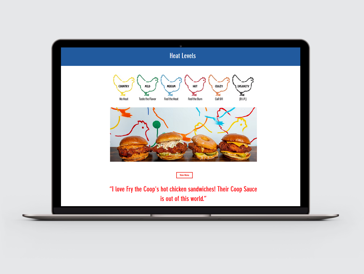
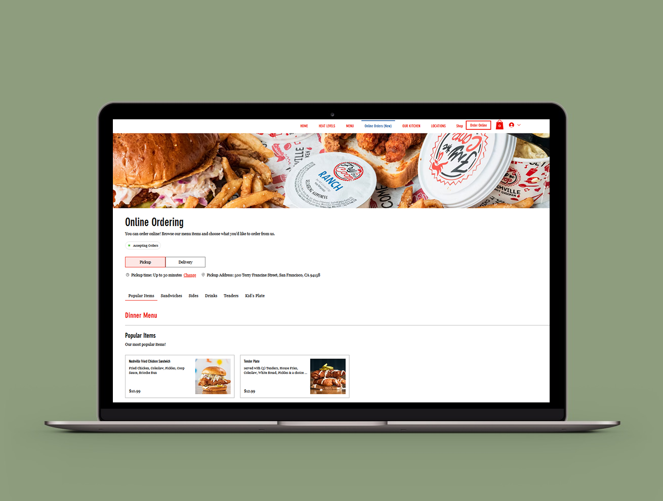
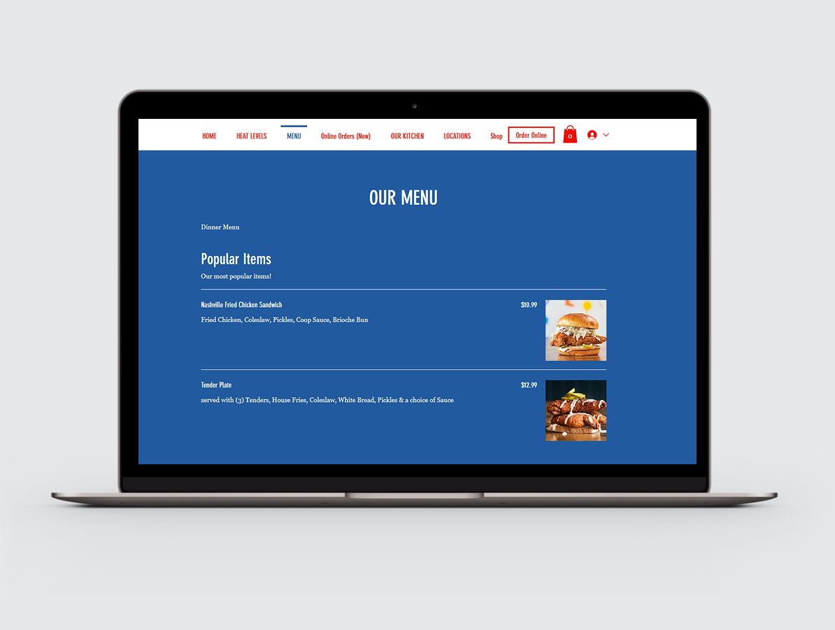
A local restaurant's website had traffic but no sales—80% of visitors left without ordering. I led end-to-end redesign, using UX research and data-driven visuals to boost online orders by 60%.

Restaurant Website Redesign

This project focused on redesigning a restaurant website to improve the online ordering experience and convert more visitors into customers. Analytics showed that nearly 80% of website visitors were not completing an order, revealing a major gap between traffic and revenue. The goal was to simplify the ordering experience, improve visual presentation of menu items, and create a clearer path from browsing to purchase.

Project Overview

Role:
Lead Product Designer
Responsibilities:
UX research
User flow redesign
UI design
Conversion optimization
Tools:
Figma
Qualtrics
Trello

THE PROBLEM

Many restaurant websites attract visitors but fail to convert that traffic into actual orders. The existing site had strong traffic but a high drop-off rate. Users struggled to navigate the menu and the online ordering process was unclear. This resulted in lost sales opportunities.
The redesign focused on:
  • simplifying navigation
  • improving menu presentation
  • guiding users toward online ordering

Stakeholders and Collaboration

This project required collaboration with multiple stakeholders including the restaurant owner, managers, and staff. A/B testing was conducted using Qualtrics to evaluate design options and ensure that the final solution aligned with operational needs.

RESEARCH & DISCOVERY

Use Case
Research on e-commerce and food delivery platforms consistently shows that visual presentation strongly influences purchase decisions.
  • A survey by Field Agent found that 83% of U.S. smartphone users consider product images highly influential when making purchasing decisions.
  • Studies in the Journal of Retailing and Consumer Services show that adding images to menu items improves consumer attitudes toward unfamiliar foods.
  • Research on online food delivery platforms indicates that appealing food photography increases willingness to try new dishes.
  • Studies presented at the Pacific Asia Conference on Information Systems show that images with larger focal objects, warmer tones, and higher contrast increase purchase intentio

KEY INSIGHTS

  • Customers rely heavily on food imagery when deciding what to order
  • Menus must be easy to scan quickly
  • Online ordering must be clearly visible
  • Users abandon the process when the flow becomes confusing

DESIGN STRATEGY

Based on research findings, I focused on three design priorities.
  • Improve Menu Visibility
    High-quality images and clearer food descriptions help users evaluate options quickly.
  • Reduce Ordering Friction
    Simplify the path from browsing the menu to placing an order.
  • Highlight Key Actions
    Make ordering and navigation immediately visible on the homepage.

BEFORE / AFTER COMPARISON

BEFORE

AFTER

Key UX Improvements

Direct Menu Access:
Users can immediately access the menu from the homepage or the Order Online button in the navigation bar, reducing unnecessary navigation steps.
Clear Menu Structure:
The menu highlights popular items and uses food imagery, concise descriptions, and visible pricing to help users quickly decide what to order.
Faster Item Selection:
Each menu item displays key information—name, description, price, and image—allowing users to evaluate dishes without navigating through multiple pages.
Streamlined Checkout:
Users can add items directly to the cart and proceed to checkout with minimal steps, maintaining momentum in the ordering process.

Impact

These improvements simplified the ordering experience and helped increase completed orders by 60%.

Key Insights

  • Users wanted clearer food images
  • The ordering process required too many steps
  • The menu hierarchy made popular dishes hard to find

Design Implications

These insights directly informed the redesign strategy:
  • Prioritize high-quality food photography
  • Use large hero images to highlight key dishes
  • Improve image contrast and warmth to increase visual appeal
  • Incorporate user-generated photos to build trust and authenticity

Design Decisions

  • Added large food photography to improve visual appeal
  • Simplified the ordering flow
  • Highlighted popular menu items
  • Improved menu navigation

Outcomes and Impact

  • 60% increase in completed orders
  • improved menu discoverability
  • faster ordering experience

Key Takeaways

The enhancements led to a 60% increase of visitors who ordered something.