FoXX Health

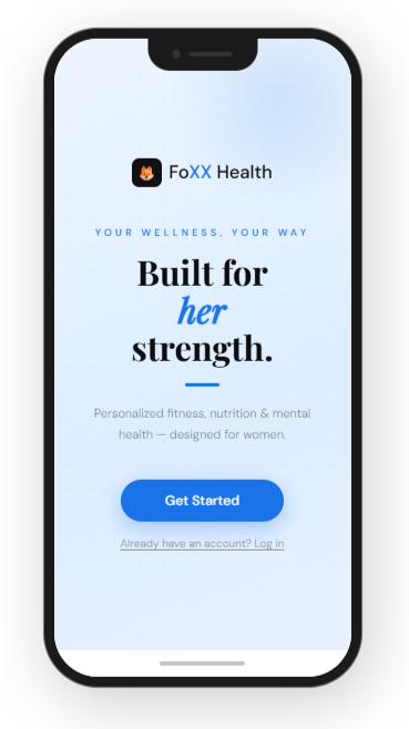
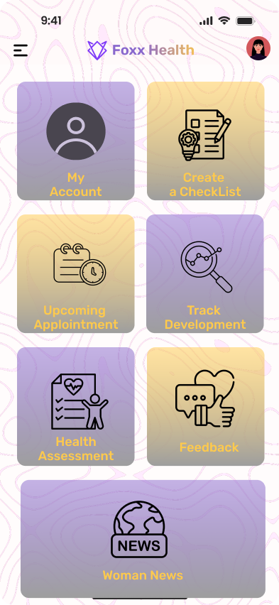
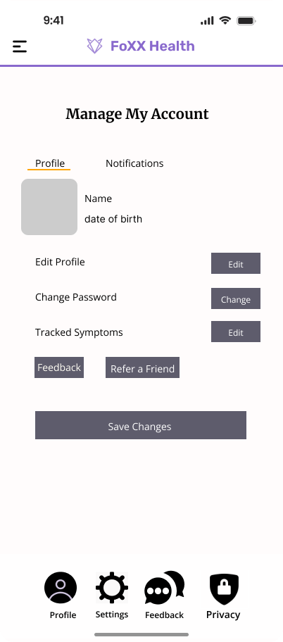
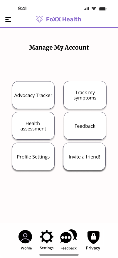
An AI-powered wellness platform designed specifically for women. It delivers personalized fitness, nutrition, and mental health support—all in one app. I led end-to-end design from concept to launch, translating complex health data into simple, actionable insights.

Foxx Health App

FoXX Health is a wellness platform designed to help users track symptoms, monitor health trends, and receive personalized wellness guidance. As the lead designer, I focused on creating an experience that simplifies complex health data and helps users better understand their daily health patterns.
Designing a health app focused on clarity, consistency, and habit-building. Most health apps overwhelm users with data and features, leading to drop-off after initial use. This project explores how simplifying the experience and prioritizing actionable guidance can help users build sustainable health habits.
This concept project explores how a health app can better support users who want to improve their wellbeing but struggle with consistency. Instead of focusing on tracking everything, the goal was to design an experience that helps users understand what to do next and stay engaged over time.

My Responsibilities
  • UX research and interaction design
  • End-to-end user flows
  • UI component design
  • Feature design for symptom tracking, notifications, and health insights

The Challenge

Many health apps provide extensive tracking and analytics, but:
  • users feel overwhelmed by too much information
  • key actions are unclear
  • engagement drops after the first few uses
The core issue isn’t a lack of features — it’s a lack of clear, actionable guidance.

Research Insights

Research on digital health tools shows that users are more likely to consistently engage with health apps when information is simple to interpret and easy to log daily. Platforms that combine symptom tracking, reminders, and visual progress indicators help users better identify patterns in their health behavior.
Key insights that guided the design:
  • Users need simple logging tools to maintain daily tracking habits
  • Health data must be visualized clearly to reveal patterns
  • Notifications must feel supportive rather than intrusive

Goal

Design a health app that:
  • feels simple and approachable from the first use
  • reduces cognitive overload
  • encourages small, consistent actions rather than perfect tracking

Design Strategy

Based on research findings, I focused on three design priorities:
  • Reduce Cognitive Load
    Present health data through clear visual summaries rather than dense statistics.
  • Encourage Consistent Tracking
    Create simple daily logging interactions that take only a few seconds.
  • Support Long-Term Health Awareness
    Use trend visualization to help users understand how symptoms evolve over time

Manage My Account

The "Manage My Account" feature allows users to control their personal information, security settings, and notification preferences within the Foxx Health platform.
Because this section contains sensitive user data, the design needed to prioritize clarity, accessibility, and trust.
Simplified Home Experience
The home screen focuses on a single primary goal, giving users immediate clarity on their current status.
Instead of presenting multiple metrics at once, the design emphasizes:
  • one key health signal
  • clear progress feedback
  • minimal distractions
This reduces cognitive load and helps users quickly understand where they stand.

Problem
Users often struggle to locate and manage their account settings in health applications. When settings are difficult to find or understand, users may feel uncertain about how their data is stored or used.
The challenge was to design an account management experience that makes it easy for users to:
  • Update personal information
  • Manage notification preferences
  • Control account security settings
while maintaining a clear and organized interface.

Structured and Focused Navigation
Features are organized to avoid fragmentation and decision fatigue. Rather than separating too many categories (fitness, nutrition, sleep), the experience is designed to:
  • guide users through a cohesive flow
  • keep interactions predictable
  • reduce unnecessary switching between sections

Design Goals
  • Create a clear and intuitive account management layout
  • Allow users to easily update personal and security information
  • Ensure important settings are easy to locate
  • Reduce friction when managing notifications and preferences
Iteration 1 – Basic Layout Exploration
The first iteration focused on exploring how key features such as habit tracking and progress summaries could be organized within the home screen. While this layout included all necessary features, it felt visually dense and required too many interactions.

Iteration 2 – Simplifying the Dashboard
The second iteration simplified the interface by prioritizing the most important information: daily habits and overall progress. Secondary information was moved to separate screens to reduce clutter.
Iteration 3 – Improving Visual Hierarchy
The final iteration improved readability through better spacing, clearer typography, and stronger visual hierarchy. These adjustments helped users quickly identify key information.

Final Design
Final Solution
The final design focuses on clarity and ease of use. The interface highlights daily health activities while providing clear visual feedback on user progress.
Key features include:
  • Simple daily habit tracking
  • Clear visual progress indicators
  • Minimal interaction steps for logging activities
  • A clean and intuitive dashboard layout
What Didn’t Work
Early iterations explored:
  • more detailed analytics dashboards
  • feature-heavy navigation structures
While visually compelling, these approaches:
  • increased cognitive load
  • made it harder for users to identify what action to take
Simplifying the experience led to a more focused and usable solution.

Visual Clarity
The interface uses a minimal visual system to support readability and focus:These choices ensure that important information stands out without overwhelming the user.
  • restrained color palette
  • strong typography hierarchy
  • clear spacing and grouping
Outcome
The final design delivers a health experience that:
  • feels approachable and easy to navigate
  • prioritizes clarity over complexity
  • supports consistent, habit-driven behavior
By focusing on guidance rather than raw data, the app encourages users to take small, meaningful actions over time.

Reflection
This project reinforced the importance of simplifying complex health information into clear, actionable interfaces.
If the project were expanded further, future improvements could include:
  • Personalized health recommendations
  • Integration with wearable devices
  • More advanced progress analytics

Login Screen

Problem
Health applications require strong security while maintaining an easy and accessible user experience. Users needed a login process that felt trustworthy, quick, and familiar.
Solution
I designed a streamlined login experience that allows users to securely access their health dashboard while minimizing friction.
Users can sign in using:
  • Email and password
  • Google
  • Apple
  • Facebook

Design Considerations
The interface emphasizes clarity, accessibility, and trust through simple input fields, recognizable authentication options, and clear visual hierarchy. This approach helps users quickly access their health tools while maintaining confidence in the platform’s security.

Symptom Tracker

Goal
Users need an easy way to record symptoms and identify patterns over time.
Design Solution
The tracker was designed with a simple entry flow that allows users to quickly log symptoms while maintaining a clear historical record.
Key considerations included:
  • quick symptom entry
  • clear symptom history
  • easy pattern recognition

Medication Reminders

Goal
Help users maintain medication consistency through simple reminders.
Design Solution
The reminder system allows users to input medication schedules and customize notification preferences.
The design prioritizes:
  • flexible reminder timing
  • easy medication management
  • clear notification controls
FoXX Health - Add Medication
9:41
📶 📶
FoXX Health
Add Medication
Morning meds
1
+
Daily
Weekly
Monthly
Sun
Mon
Tue
Wed
Thu
Fri
Sat
8:30:00 AM
+
12:45:00 PM
+
Save

Women's Health Content Hub

Goal
Provide reliable health information in an accessible format.
Design Solution
The content hub organizes articles and health resources into clearly structured categories to help users quickly find relevant information.

FoXX Health - Women's News
9:41 🔋
FoXX Health
Women's News
📰 Breaking: New women's health study
💪 Pelvic floor exercises
🥗 Nutrition for hormone balance
🧘 Mindfulness for moms
❤️ Heart health awareness
😴 Better sleep naturally
🌿 Natural anxiety remedies
🧬 Hormone cycle explained
🩺 Preventative screenings guide
🦴 Bone density awareness
🍎 Healthy recipes
🏃 Home workouts
💧 Hydration myths
Women's News (Scroll to see all articles)